




Pick website inspiration on the use case, the level of finish you expect and the way you will turn it into a brief. Sort quickly with sources that filter by type, style or technology, then look hard at what will reproduce in a real project. If you are scoping a site, a general gallery is rarely enough, while a filter by CMS, by style or by use case saves time.
Which sources to choose for website inspiration

Which source you need depends on what you are looking for. Awwwards works well for filtering by technology, Webdesign Inspiration helps compare formats and styles, and Pinterest gives you a mass of images that points to a visual direction but does little for a brief. For a Webflow project, the most effective approach is to sort by use case and by style at the same time, while watching what can be carried over into the class system.
| Source | What you find there | Filtering | Limitation | Value for Webflow |
|---|---|---|---|---|
| Awwwards | Design Agencies, Business & Corporate, E-commerce, Architecture, Restaurant & Hotel | By category, by tag, by technology, by country | The volume quickly leads to collecting without sorting | Lets you isolate references compatible with Webflow, React or WordPress |
| Webdesign Inspiration | Corporate, E-Commerce, Portfolio, Product, Web Service / SaaS, WordPress Themes | By site type and by style | Less detailed on the technical side | A good starting point for a showcase site or SaaS brief |
| Webdesign Inspiration | Big Photo, Clean, Creative, Dark, Futuristic, Minimalist, Modern, Typographic | By style | Style says nothing about the production system | Handy for settling on a visual direction before mock-ups |
| Pinterest, Web Design Inspiration collection | A collection of pins built up over time | By collection | Little editorial hierarchy | Good for spotting visual patterns, less so for deciding on a stack |
In a scoping workshop, that split is usually enough to separate the source that feeds the idea from the source that feeds the brief. At mad.studio, we check the site type, the style and the technology before moving into Figma or Webflow CMS. On our projects, naming classes by convention from the outset keeps the system manageable and limits rework at sign-off.
From reference to brief: observe, then transpose
Read a good reference as a system, not as an image. We look at the information hierarchy, the visual rhythm, the components that recur, the accessibility choices and the consistency between pages, which is the web design work rather than the effects. Then we carry what will last into a working brief, with named blocks, states, variants and class rules. On the engagements we have led, this step stops the team copying effects that do nothing.
Start by isolating what is reproducible in Webflow, then what has to stay specific to the reference. A recurring component, a card grid, a hero block, a navigation or a typographic hierarchy all translate well. An animation tied closely to its content, or a one-off layout, takes more judgement. When the brief names the classes, the variants and the use cases, the production team moves faster and there is less rework at the end.
By website type: SaaS, premium, corporate, e-commerce
The type of site changes what you look at first. Structure counts as much as style, and the site architecture is decided before the mock-ups. A SaaS needs a legible product hierarchy and marketing pages that change often, close to landing page creation. A premium site needs precision in the composition, a corporate site needs trust signals, an e-commerce site needs a structure that carries a catalogue and a purchase journey. Webdesign Inspiration's site type filters, and Awwwards' categories, keep those uses apart.
| Type | What to look at | Platforms to consult | What we avoid copying as is | Webflow angle |
|---|---|---|---|---|
| SaaS | Web Service / SaaS pages, product clarity, block repetition | Webdesign Inspiration, Awwwards | Effects that slow down reading the product | Good ground for marketing pages that change often |
| Premium | Big Photo, Typographic, rhythm and execution details | Webdesign Inspiration, Awwwards | Overloaded compositions | Suited to a high-end finish without weighing down the system |
| Corporate | Business & Corporate, navigation, editorial structure | Awwwards, Webdesign Inspiration | Purely decorative menus | Suited to showcase sites that must stay easy to take over |
| E-commerce | E-Commerce, categories, product pages, variants | Awwwards, Webdesign Inspiration | Journeys that neglect catalogue navigation | To be tied to a clear CMS logic and well-named collections |
| WordPress to Webflow | WordPress Themes, structure, recurring components | Webdesign Inspiration, Awwwards | Template habits carried over without reworking the system | Useful for preparing a migration and keeping a clean editorial base |
In practice, a portfolio and a product page are not judged on the same things. For a SaaS, we look at how the proof points repeat and how clear the message is. For an e-commerce site, we look at the collections, the categories and the way blocks repeat without breaking the whole. We usually run this sort before opening Figma or Webflow CMS, then turn it into components and collections. For a WordPress to Webflow migration, it mainly keeps the habits of the original template from coming back.
The website visual styles that save time
Style is there to rule options out, not to look pretty. Webdesign Inspiration offers styles such as Big Photo, Clean, Creative, Dark, Futuristic, Minimalist, Modern and Typographic, while Awwwards adds tags such as Clean, Minimal, Scrolling, Single page, Typography or WebGL. When you are searching quickly, pick two families and discard everything that tells a different story.
A dark site can carry a premium mood, but it says nothing about the hierarchy or the clarity of the journey. A minimalist site can work, but it does not suit a brand that needs a strong narrative world, and style never replaces conversion optimisation. Awwwards' country filter also surfaces references from a given market, including France, the United States, the United Kingdom, Italy or Canada. For a brief, that precision keeps you from mixing visual codes that do not make the same promise.
Technologies and CMS: what a website reveals
The stack tells you something useful about how a site was built. Awwwards filters by Webflow, WordPress, Shopify, React Websites, Figma, Framer and Next.js, which separates a showcase reference from a more technical or more constrained site. For scoping, that filter stops you modelling the project on an effect the planned CMS or content governance cannot reproduce.
| Technology or tool | What the filter tells you | What it means for the brief | Frequent use | Point of attention |
|---|---|---|---|---|
| Webflow | Site built as a class-based design system | The brief must name the components and the variants | Showcase sites, marketing pages that change often | Without a class structure, the rework drags on |
| WordPress | CMS extensible through plugins | Governance and maintenance must be scoped | Catalogues, online booking, high editorial volume | Technical dependencies multiply quickly |
| Shopify | E-commerce signal | The brief must prioritise catalogue and purchase journey | E-commerce sites | Product logic comes before visual direction alone |
| React Websites | Site closer to an application front end | The scope must be written precisely | Digital products | Design must anticipate functional complexity |
| Next.js | Modern web stack signal | The brief must stay compatible with modular components | Sites with high technical requirements | An overly decorative reference can hide the real constraint |
| Figma | Design and visual scoping stage | The handoff must be designed to go from concept to build | Prototyping, mock-ups, design system | A prototype without component rules serves production poorly |
Looking at the stack keeps you from drawing a false parallel between inspiration and feasibility. On mad.studio projects, we check whether the reference is a Webflow showcase site, an editorial WordPress, an e-commerce site or an interface closer to React, which would make it a headless development project. That sets the right architecture from the start and gives you a brief the team can pick up without rewriting half the decisions.
What a premium website should really inspire
A premium site inspires through restraint, precise spacing and the quality of its content, which is UI and UX design work you do not see at first glance. The best references show confident typography, understated motion, sharp execution details and blocks that breathe without scattering. Awwwards' E-commerce, Fashion, Business & Corporate and Design Agencies categories are good hunting grounds, as are Webdesign Inspiration's Big Photo, Typographic and Minimalist styles.
For a luxury site or a high-end service, a field we work in through premium brand design, look at the transitions, the hierarchy of messages and the way content is laid out page after page. A beautiful image is not enough if the copy is weak or the journey asks too much. On the premium and SaaS projects we have run, such as Visa Platinum, Visa Concierge, MyThalassa and Stockly, visual consistency often comes down to very little, but those details repeat everywhere.
Sources to browse quickly
The fastest sources are the ones that help you decide in a few minutes. Awwwards sorts by category, tag, technology and country, which gets you through a first cut. Webdesign Inspiration adds site types and styles, while Pinterest is mainly for spotting visual patterns in a large collection of pins. To move fast, pick one source for scoping, one for the visual direction and one to check technical consistency.
Awwwards works well when you are looking by sector, Business & Corporate or E-commerce for instance. Webdesign Inspiration works better when you already have a use case in mind, such as Corporate, Product or Web Service / SaaS. Pinterest earns its place when you want to capture a visual language, then leave the gallery and write the brief. A short sort saves you a pile of references you cannot use.
If you work with a studio or an in-house team, keep three screenshots at most per intention. One for the style, one for the structure, one for the level of finish. Beyond that, the brief becomes a collection of tastes with no hierarchy.
Moving from a reference to an art direction
This is the step most selections skip: between the screenshot you like and the mock-up that holds up, a translation is missing. It happens in four stages, and you write them down.
- Name what you like. Not "it's clean", but what exactly: the generous margins, the typographic contrast, the restrained palette, the rhythm between blocks. Until you name the appeal, you cannot transpose it.
- Separate form from content. A reference often impresses because its content is good, not because its layout is. If your message is longer, more technical or less narrative, the same layout will not produce the same effect.
- Test on your real pages. Judge a direction on three screens at least: a home page, a dense inner page, and a secondary page with little polish. The third one tells you whether the system holds.
- Write the rules. Type scale, grid, spacing, states, recurring components. This document, not the inspiration board, is what gets picked up in production.
So the deliverable is not a board of screenshots, it is a page of rules listing the blocks to carry over, those to exclude and the variants expected. It fits on one page and it saves a good share of the back-and-forth at the end of production.
One useful guardrail: two references at most as the dominant axis, and a third only for a specific use. Beyond that the direction becomes an average, and averaging three strong positions always ends up bland.
What we carry over from a reference, and what we leave
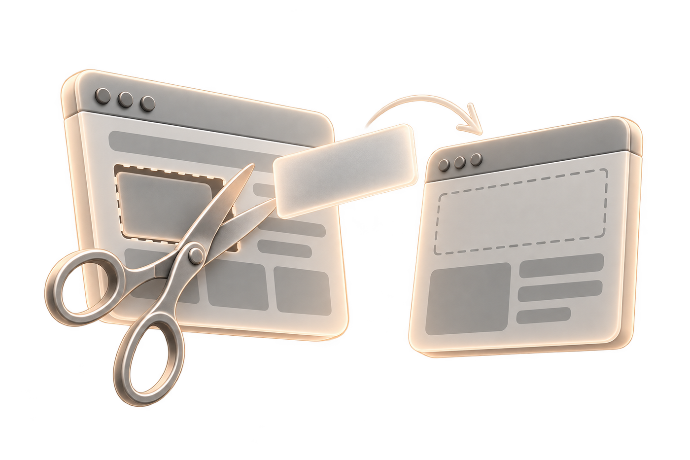
Take an inspiration apart. Some things transpose almost as they are, others belong to the original site and do not survive the change of context.
| Element observed | Transposable? | Why |
|---|---|---|
| Information hierarchy and block order | Yes | It is a structural decision, independent of the content |
| Type scale and spacing rhythm | Yes | Translates into reusable rules in the design system |
| Recurring components: cards, heroes, navigation | Yes | They get named and broken down into variants |
| Palette and image treatment | With caution | Depends on the brand and on the quality of the visuals you have |
| Animation tied to a specific piece of content | Rarely | It works for that content and falls apart on anything else |
| One-off home page layout | No | It does not hold on the secondary pages, and that is where it shows |
| The tone and length of the copy | No | Your message has neither the same density nor the same audience |
The fastest test: if you cannot describe an element as a reusable rule, it belongs to the reference and not to your future site.
What design trends really tell you
The trends that matter are not the loudest ones, they are the ones that make a site clearer. The Minimalist, Typographic, Dark, Big Photo, Creative and Futuristic styles keep coming back because they filter quickly and adapt well to marketing pages, showcase sites or portfolios. The Clean, Minimal, Scrolling, Single page, Typography and WebGL tags also show which visual effect carries the direction.
What counts is the stability of the message. A strong style can help a brand stand out, but it turns fragile if the content changes often or the pages multiply. On an editorial site, a spectacular structure wears out faster than a restrained composition. On a site that publishes often, the job is to keep a system that takes updates without breaking the layout.
On projects that require volume, a trend is useful to set a direction, then reduce it to a system of reusable components. That is where the design system takes over, with rules that keep the site consistent as pages are added.